Agile policy teams

There’s a brilliant event taking place today. #oneteamgov is having proper crack at bridging the policy/delivery divide.

Anyone working in digital knows what an agile product team looks like. As a fun thought experiment, I wondered what would a multi-disciplinary agile policy team would look like.

  • You would have to start with the product/policy manager. They conduct the orchestra, understand the user needs, and prioritise the ways of meeting them. In a policy context this also means being to be able to accurately channel ministerial intent; i.e. being the relevant SpAd’s best friend. Ideally this person has some experience of working with digital because so much delivery is rooted now in digital services; and digital provides all the best team tools for effective delivery.
  • Next hire would be a delivery manager. When I moved from policy into product I was particularly struck by the rigorous approach taken to prioritisation, enabled by strong delivery management. I’m also a big fan of separating the roles of owning the vision with owning the delivery. Badging policy work in phases like discovery/alpha/beta will help teams chunk up the work, and could have ancillary benefits help… managing… u-turns? I also don’t see why scrum or kanban couldn’t be used in good effect, if only for task management. OK, it’s hard to rapidly prototype and iterate a law once it is statute, but that shouldn’t exclude the rapid generation, iteration and validation of policy ideas and proposals in discovery and alpha. Some interesting arguments for git-based development of legislation have already been made.
  • The 3rd name on the team sheet is design, and specifically a service designer. As well as being skilled at ideation and interpreting needs from research, designers are excellent at communicating ideas verbally or visually and are the kind of people you want in front of ministers. I also consistently struggle to think of a single area of officialdom that would not be improved by better content design so get them onboard as soon as you need to start putting pen to paper.
  • Research and analysis. In the ideal world this is a data scientist with an excellent grounding in social research and epidemiology. The extraordinary difficulty of finding someone like that means you probably have to pick depending on the policy area. Someone comfortable with the micro and the macro would be the place to start.
  • A stakeholder manager. Policy work is so often about accumulating the views and knowledge of as wide a group of people as possible and synthesising that in order to support decision making. Getting around the various interest groups is a full time job. A good communicator, networker, and seller of ideas will get your policy flying.
  • An economist. Because all roads lead to HMT.

There are many more who need to be involved in policy development but above are a few ideas for an irreducible core.

Policy makers will probably read this thinking “Yawn, we do all that already.” But whisper it, I don’t think you/we do. The people I mention above do join together in the civil service, but not usually as part of a specific autonomous unit. They remain for the most part in silos, feeding into lots of different projects at a time. In other words, a bit like IT firms where development is in one department, testing in another, and infrastructure or support in another. A model which seems so old fashioned now.

Agile was described to me recently as “collaboration, iteration, prioritisation”. I think that autonomous agile policy teams can help achieve those things more easily, and deliver better policy, quicker. I’d love to know if anyone’s tried this or what people think.

Update 16:07 on 29 June: thanks to SophieOlivia and Matt who have pointed out to me that they would have a user researcher on the team. I wholeheartedly agree.

This story was originally published at Medium.
Intranet iterations

We’ve been doing some more work on our intranet. Here’s a rundown of our latest release and some final thoughts on what I’ve learnt working on this product.

Why take a digital approach to an intranet?

I’ve said in previous posts that intranets can be the scorn of digital purists. “Why not just have a wiki and a blog – it’s totally free?” they cry. Well, maybe.

But as this is my last intranet sprint (sprintranet?) I wanted to make the case for taking a digital approach to this ever present departmental tool. I think there are 4 compelling reasons.

  1. Improved experience for users. The obvious one. Civil servants are users too, and saving them time and effort with products that work is better for them, and better for taxpayers.
  2. It’s a means of spreading digital culture and techniques widely across the department. Talking to lots of teams in the department about their intranet content or involving them in user research has enabled me to introduce principles of agile and user-centred design to lots of people who otherwise would never have encountered these techniques. A good thing in the wider scheme of digital transformation.
  3. Getting content design more widely understood. I’m increasingly convinced that content design training should join information security and unconscious bias as mandatory for policy civil servants. Until that happens, working with teams on their intranet content is a decent alternative.
  4. It’s a good training ground. A staff intranet is a reasonably low stakes environment, which makes it ideal for practising agile techniques, user testing and the like. Particularly as uses are on your door step. Four different fast streamers have now participated in running guerrilla testing or pop up labs in the department, and done brilliantly at it.

On to the highlights of our latest release. As ever, if anyone is interested in playing around with the intranet WordPress theme, it’s available on Github. All comments and thoughts welcomed.

Homepage

In our last intranet post we talked about the changes to the homepage design. The changes have attracted a lot of great comments. But more importantly our ongoing testing is showing users are completing popular tasks more easily.

Of course not everything is working perfectly, so we are continuing to tweak and improve. For instance we found users were not noticing when new content was being posted in the campaign box. So we introduced a ‘new’ banner to signal this event.

Screen shot of 'new' banner on intranet homepage

Information architecture

Our ongoing user research has repeatedly surfaced pain points for users navigating the site. Users did not always understand the main section headings, or what topics might be listed underneath.

To test further we ran several card sorting sessions to try and come up with better labels and a more intuitive architecture. Despite plenty of hard work, it turned out we couldn’t. Naming and sorting things into categories is just one of those timeless problems. We ended up agreeing that what we had was probably the least worst option.

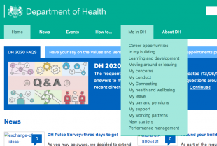
To attack the problem from another angle we introduced some new functionality. We implemented the brilliantly named Accessible Mega Menu. This now provides a drop down of topics that appears underneath a section heading, to help users see what is available and help them answer their questions more quickly.

Screen shot of drop down menu on intranet homepage

Events

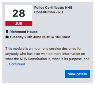
The department puts on a wide range of events.  By making use of theEventbrite API, our intranet administrators are able to create and manage events using all the functionality of Eventbrite. Once published, the event details are pulled automatically into the relevant intranet pages. Along with some design tweaks, we’ve made an already excellent events booking process even better.

Screen shot of events box on intranet events page

Our next sprint will be later in the year. Look out for further updates from a new product manager then.  And a final word of good luck and thanks to the brilliant team. My laptop will continue to wear our mission patch with pride.

This post was originally published on the Digital Health blog.

Bridging the digital language divide

Digital transformation in government will require civil servants of all professions to pull in the same direction. Digital, policy, procurement, finance, analysis. All on the same page. But those groups often do not work in the same way. This slows us down.

One notable difference in approach is language use.

Take the digital profession. Digital in government has a particularly distinct lexicon. Hearing someone mention ‘user needs’ unprompted is a pretty accurate identifier of one of its members. Certainly moreso than owning a MacBook.

This profession is also packed with devotees of agile, favouring individuals and interactions over processes and tools. No surprise then that they have a plethora of terms to describe different types of discussion. Stand-up, sprint plan, inception, retrospective, futurespective, show-and-tell. All brilliantly useful. Once you know what they are.

Other government tribes have languages too of course. If you talk about ‘requirements’, it’s likely you are a member of IT profession. A mention of ‘key milestones’ outs you as a project manager. When I first joined the civil service as a policy professional I recall being asked to do a ministerial ‘sub’. As 50% New Yorker I couldn’t fathom how making the Secretary of State asandwich could possibly help.

The language issue feels important to me. As well as the misunderstandings it can lead to, it is a canary in the mineshaft of deeper divisions. So how could we improve things?

In the field of foreign language teaching, academic experts have long agreed that teaching a foreign language is much harder without also acknowledging the culture, i.e. the beliefs, values and behaviours, of the other. True understanding requires knowledge not just of words, but of words in their proper context.

Anyone who has talked at length about user needs to blank faces will recognise the problems caused by a lack of shared understanding of context. It may be possible for others to understand the words and the everyday meaning, but developing the reflex that if a user fails it’s our fault and not theirs does not happen overnight. ‘He/She doesn’t get it’ is a phrase one may hear among digital circles. But remember to our audience we can sound like the most naive of broken records.

Education professionals have thought at length about how best to learn about other cultures. Prof Mike Byram at Durham University has developed a series of ‘savoirs’ or competencies* for intercultural skills. Two stand out as particularly relevant to interdisciplinary working in government.

  • Ability to evaluate perspectives in one’s own and other cultures.There are many teams who run services from a pre-digital spend controls era and have not encountered a new way of doing things through no fault of their own. What might we be taking for granted which we need to question?
  • Readiness to suspend disbelief about other cultures and belief about one’s own. A former policy colleague recently remarked he felt he would be laughed out of the room if it was ever suggested that a policy person just might be able to do something useful in a delivery role. This perception has to change.

Beyond a shared understanding of language then, we need to share experience of digital culture: values of being user-focussed, open, sharing, collaborative, experimental, all underpinned and connected by the shared infrastructure of the Internet. The digital profession is better than many at demonstrating and sharing its values, but we shouldn’t let up.

At the same time, to foster better and quicker understanding and cooperation we need to see problems from other perspectives. Being good at this is not an innate ability but, as educationalists have shown, is a cognitive skill that can be learnt. In a collaborative era of transformation all professions may need to take skill building in this area more seriously.

Just one more time, what is digital again?

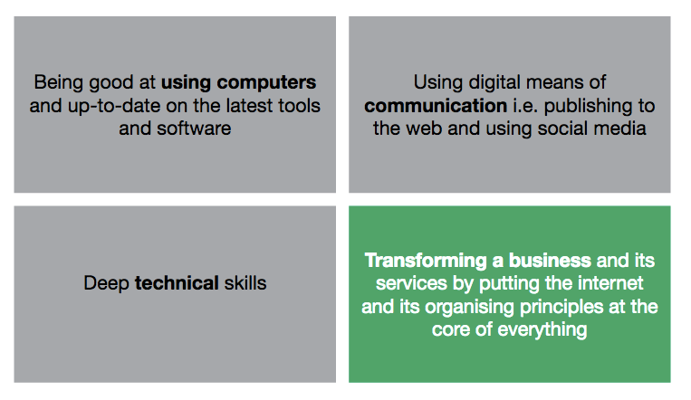
I’ve acquired a ton of new knowledge since moving from a policy to a digital role. The nugget I’ve found myself repeating most is this elegant and succinct taxonomy of digital capability.

“Depending on where you look, digital capability might mean one of four things. The ability to use a computer. The ability to tweet. The ability to do something requiring specific deep knowledge, like technical architecture, user research or front-end design. Or the ability to see how digital technology enables the transformation of an organisation to focus on user needs, and make that change happen.”

The digital community aside, civil servants in many departments are far from settled yet on what is meant by digital. The post of ‘digital officer’ is being advertised right now at one of the big departments as a job in a communications team. Too often in my previous policy experience, digital has been lazily characterised as ‘whizzy’.

But getting a common understanding of this taxonomy is vital. Pursuing perfection for each definition requires different skills, strategies, and organisational design. And obviously will lead to different outcomes. It’s much harder for government to pull together in one direction when the name of that direction is not yet commonly agreed and understood.

I’m later to the digital party than many. No doubt lots of effort has been put into getting this message across. But I have arrived before quite a few too, and can safely say the job is far from over.

Originally published on Medium.

10 things policy can learn from product

Richmond House

Six months ago I made a career pivot from policy making to product management. The roles require a similar mix of empathy and politics, so I feel I’ve taken to it reasonably well. Alongside a deep understanding of Internet-enabled technologies, a notable difference is how much and how effectively product management makes use of specific tools and methodologies to solve problems.

So here are ten techniques I would bring into a policy team if I went back. If any of the terms don’t make sense, Ben Stevens from the Home Office has posted a handy glossary.

  1. Work in sprints. Choose a time period of 1 or 2 weeks to help give structure to the team’s work. Get everyone together at the start of the sprint and agree the things you are going to focus on completing in that time, remembering that new tasks will come in too. This is called sprint planning.
  2. Hold ‘stand-ups’ over the course of the sprint, and ‘retrospectives’, and ‘show and tells’ at the end of it. Don’t be spooked by the language. These are just meetings, so not exactly an alien concept to policy makers. There’s no need for me to repeat better guidance elsewhere on this, except to endorse how useful they are as an ensemble.
  3. Get a wall. Every team needs a wall. I managed a major house renovation last year and even had a wall (this is not a joke). At its simplest this is expressing a task on a Post-It note, fixing it to a nice flat surface that people can gather around, and moving the tasks through columns labelled ‘doing next’, ‘doing now’, and ‘done’. Do this, and then feel the energy and sense of achievement coursing through the team as they deposit card after card in the done column at each stand-up.
  4. Create genuinely multidisciplinary teams. I spent some time shadowing my mentor who works on NHS.UK Alpha a few weeks ago. It’s a full-blown agile team, replete with product manager, delivery manger, content writers, designers, and developers. Having such expertise around a table enabled them to do magical things, like designing the key features of a GP look-up service, in record time. My experience of policy is usually hierarchical group of something akin to project managers. Other experts tend to be in a box somewhere, wheeled out for special occasions. It also now seems amazing to me that design thinking in policy is still seen as the cutting edge while it’s de rigeur in digital.
  5. Make it someone’s explicit responsibility to knit the team. The mantra goes, “the unit of delivery is the team”, and commensurate effort is placed in getting that team working brilliantly together. My experience working in policy teams is that if they are working great, then great. But if they are not, the response is usually a shrug and sporadic suggestions for ‘more social events’. Digital methodology encourages constant communication between the team using stand-ups. It celebrates successes through show+tells, and does a thorough job of learning from failures through retrospectives. The result is a team completely aligned around an objective, with everyone feeling they are part of something important, and fantastic pace of delivery. Tasks fall to the team not individuals. This reduces risk of single point of failure.
  6. Separate responsibility for day-to-day delivery with big picture and vision. In digital there are overlapping and complementary roles called product manager and delivery manager. The former focusses on macro issues: vision, roadmap, stakeholder management. The other focusses on micro issues: unblocking the obstacles the team faces day-to-day, and doing the team coaching I describe above. This structure recognises something important about our minds being poor at doing two things at the same time. It’s very effective.
  7. Try out some new collaborative tools. Digital teams more naturally have their fingers on the pulse of internet-enabled tools to facilitate team communication, prioritisation, or collaboration. I know IT systems can create barriers to this; but in an age where everyone has a smart phone it’s not hard to find workarounds. If you had to pick any, for me it is Slack. There’s a bit of a backlash against Slack at the moment (Slacklash?), but frankly I’m still at the crest of the wave of appreciation that sees how much more efficient than email is at enabling team interaction.
  8. Prioritise properly. Product recognises you can’t do everything, so have a plethora of techniques for deciding what comes next. Do a few things well rather than lots of things mediocrely, and be rigorous in your approach to choosing which those things should be.
  9. Clap more. Digital teams religiously clap their teammate’s or others’ presentations. This is not only courteous, but sends the presenter away with those few extra endorphins that make it all seem worth it.
  10. Be agile. Note the small ‘a’. My simplest interpretation of this is understanding that for almost everything, your first answer could well be wrong. Doing something and then testing it is better than trying to get it perfect first time. As long as it is labelled as such, it is fine to say something is a prototype or early version and will be iterated, improved, or even binned.

None of these suggestions are especially complicated. But they can be tough to implement in teams unfamiliar with the language and culture. Digital teams should help with this where they can, as forming good habits should not solely be the preserve of digital. They should be for everyone.

I’d be delighted to give my novice advice to any policy makers, so do get in touch if it would help. Hat tips to Lisa, Matt, and Kylie for product coaching, andBenji for delivery management advice.


An agile intranet

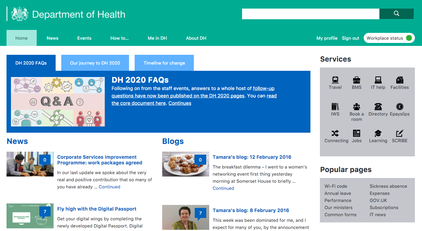
DH intranet homepage screenshot

We designed our intranet to be continuously improved, and over recent weeks have been doing just that. Since the intranet’s launch last year we have gathered data and done extensive research to deepen our insights into our users’ behaviour. This is enabling us to flex our product to meet our users’ changing needs – in line with digital best practice.

In our most recent development sprint, we focussed on the homepage. The intranet homepage is the first thing most people in the department see when they log on in the morning, so it’s not surprising that 99.9% of user journeys begin there. That’s not true of all websites – GOV.UK pages are often reached via a search engine – but our default makes the homepage a prime piece of digital real estate. It deserves excellent design and only the most important content or features.

From looking at site traffic we could see the content users visited most over the past year. For instance: guidance on performance management, expenses claims, booking video conferencing, and a few specific  forms. Over the last month or so, content about the DH2020 change programme has also been very popular.

This data informed our qualitative research. We interviewed twenty-one individuals, asking them about their use of the intranet. We also observed them using the homepage to try and perform particular tasks. As well as interviews, we ran card sorting exercises and a co-design workshop where users drew sketches of their ideal homepages, or voted on features they liked from other government intranets. The range of ideas generated ranged from the pragmatic to the extravagant. But the discussion was invaluable in helping our suppliers understand the needs of DH staff. Over two weeks our experts translated those insights into some of the changes you can now see:

  • Bringing in common design patterns by integrating the menu, search and login into the header to help users find them
  • Developing prominent areas for links to popular services and pages; these are customisable by our content team so can change as needs change
  • Introducing a campaign box to highlight the most important ‘need-to-know’ information of the moment
  • Increasing the number of news stories further down the page; as the large number of users felt the stories dropped off the homepage too quickly
  • Retaining a clean design that users responded to well, but binning the bits that users did not need or want anymore

Communicating via Slack across several UK locations, the team deployed the changes early last Tuesday morning. Thanks to the brilliant work of the developers we encountered almost no bugs, and by the time we got into the office some fantastic feedback had started to come in.

Launching is the start of a process, not the end. We’re moving straight into more user testing, including those using assistive technologies, to ensure our changes are performing as we want.

An ‘agile intranet’ is something the department should be proud of. Internal services and tools are rarely built in this way. It has only been possible for us to effect improvements to this product quickly, cheaply, and securely thanks to our predecessors. They left us a site built on open source software, to open standards, with no contract lock-in, and with the precedent set for relentless focus on user needs. Long may that continue.

Originally posted to Digital Health Blog.

How to do user research on a shoestring

User research is the bedrock of digital transformation, and without it we have no hope of developing great products and services. Ideally your team has a dedicated user researcher, you can access laboratory facilities when you want, and you have a whole range of tools and techniques at your disposal. When the Department of Health first redeveloped its intranet last year, the new site was built on extensive user research.

We are now undertaking further development to ensure the intranet continuously improves, but are more resource constrained than for last year’s overhaul. Over the last couple of weeks I have discovered that lack of budget needn’t be a blocker. Using so-called guerilla techniques, you can get invaluable insights on a shoestring budget.

We have been thinking about how to meet our primary goal for the intranet, that users can find everything they need and access the services they want. Unpacking this requires us to understand: what the most popular information or services are, how easy they are to find, and whether the content meets the specific need. Following a recommendation from a developer on our project I’ve been reading Undercover UX, a guide to user experience design on a budget. That, along with expert advice and help from the team, gave us enough to get started.

  1. Brainstorm. First we sat down as a team to write out as many needs as we could think of, thinking as broadly as possible. This exercise needn’t take long, and required no more than sticky notes, pens and a wall. As employees of the department, the team are all users too.
  2. Validate and prioritise. Next we cross-referenced our hypothesised needs against search data and site traffic. Some interesting patterns were revealed, for instance the way the term ‘hospitality’ drops out of search data as spending controls were brought in, or that many users use in-site search to try and find BBC News. Some of the needs were sufficiently well-understood to be specific, like finding the wifi password for the building, while others were vague and will require more work. For instance searches for ‘performance management’ are very frequent but do not reveal precisely what information is sought. You can view our list of around twenty top needs here. I’d be a little surprised if they were radically different to every other intranet in the world, but if you disagree let me know.
  3. Set up a “pop-up” user research lab. We then conducted a series of 1-1 interviews with users, while an observer took notes. To set up the lab, we found a space in the office, developed a script around a few key tasks that we wanted to observe the users performing, and recorded the sessions using Quicktime screen record which is installed as standard on a Mac. It’s the first time I’ve done this, and watching a user try to complete a task only to hear them exclaim of a page “I just have no idea what this is telling me” is both chastening and highly motivating.

Over the course of a morning we got conclusive evidence on content that was or wasn’t meeting needs, as well as insights into users’ search and navigation habits.

I realise the process described above is not perfect, but it is important not to let the perfect be the enemy of the good. When users are on your doorstep, there really is no excuse not to understand their needs.

Originally published on the Department of Health digital team’s blog.

Continually improving our intranet

No digital product is ever perfect or finished. Even a site that is 90% cheaper than its predecessor, and boasts a user satisfaction reaching post-launch heights of 80%. My challenge as the new product manager for the Department of Health’s intranet is to build on that daunting baseline, and carry on the great work of my predecessor, Kylie Mulholland. Revisiting the lessons learned from the intranet’s first development seemed a good place to start.

Over the summer we ran a discovery phase to understand how people were responding to the new site. We found that overall, users much preferred the new product to what came before. However, they would still like to find things more easily through either search or navigation, particularly the things that help them do their job. These findings were borne out by analytics data: video conferencing arrangements consistently appear among the site’s top search queries. The discovery also revealed unmet needs on the editorial side, where content owners and editors wanted a more streamlined publication process.

Last week we brought together  a multidisciplinary agile team to begin a new period of development. We work in several organisations and multiple locations; Whitehall, Old Street, and as far as Atlanta, Georgia, so online tools like Slack, Basecamp, and Talky are helping to keep us connected with each other and our users.

Stubborn on vision; flexible on details

Our first step was to draft a set of high level goals for this phase of development, which support our overall vision of making the DH intranet the best in government. As ever, we welcome feedback.

  1. Users can find everything they need and access the services they want
  2. The intranet is accurate and trusted
  3. The intranet is easy and quick to update
  4. The intranet encourages user engagement
  5. The intranet meets the Digital by Default Service Standard

Borrowing a method from the Government Digital Service, we then built a prototype roadmap. This exercise forced us to think about what we would have to learn or prove if we wanted to achieve our goals. For instance, to show that “users can find everything they need”, we need to first find out what users are looking for, and then show, using data, that our improvements actually do help users find those things more easily.

We also identified and prioritised the big themes emerging from the discovery and mapped them against a rough timeline of development sprints. These included search and navigation, events, content management, and sign-in.

Finally, we used the roadmap to map out: our users, the wider ‘system of systems’ that support the intranet, our most important stakeholders, our assumptions, and any dependencies. This helped surface challenging questions early on. Our prototype roadmap is on display in Richmond House and will help us communicate to stakeholders what we are doing, why, and broadly when.

Our first sprint

Before we get going on new features, the team are first reviewing and cleaning the code base, fixing bugs along the way, and by the end of the week we’ll have it back in GitHub.  Making things open makes them better and from next week any organisation can take our code and ideas and start to build their own intranet sites, according to their own users’ needs.

I’ve learned a lot in my first weeks in product management. It has not taken long to experience the tension between user needs (what evidence suggests end users of the product want to see) and business needs (what other stakeholders would like their users to see). This forces you to ask some pretty fundamental and philosophical questions about the real purpose of the ‘thing’. I’ve also learnt that getting the right policy, process, and governance around the product may be at least as important as the product itself. Finally, I’ve sensed that many digital folk think that intranets are the devil’s work! It’s our job to prove them wrong.

Originally published on the Department of Health digital team’s blog.