Intranet iterations

We’ve been doing some more work on our intranet. Here’s a rundown of our latest release and some final thoughts on what I’ve learnt working on this product.

Why take a digital approach to an intranet?

I’ve said in previous posts that intranets can be the scorn of digital purists. “Why not just have a wiki and a blog – it’s totally free?” they cry. Well, maybe.

But as this is my last intranet sprint (sprintranet?) I wanted to make the case for taking a digital approach to this ever present departmental tool. I think there are 4 compelling reasons.

  1. Improved experience for users. The obvious one. Civil servants are users too, and saving them time and effort with products that work is better for them, and better for taxpayers.
  2. It’s a means of spreading digital culture and techniques widely across the department. Talking to lots of teams in the department about their intranet content or involving them in user research has enabled me to introduce principles of agile and user-centred design to lots of people who otherwise would never have encountered these techniques. A good thing in the wider scheme of digital transformation.
  3. Getting content design more widely understood. I’m increasingly convinced that content design training should join information security and unconscious bias as mandatory for policy civil servants. Until that happens, working with teams on their intranet content is a decent alternative.
  4. It’s a good training ground. A staff intranet is a reasonably low stakes environment, which makes it ideal for practising agile techniques, user testing and the like. Particularly as uses are on your door step. Four different fast streamers have now participated in running guerrilla testing or pop up labs in the department, and done brilliantly at it.

On to the highlights of our latest release. As ever, if anyone is interested in playing around with the intranet WordPress theme, it’s available on Github. All comments and thoughts welcomed.

Homepage

In our last intranet post we talked about the changes to the homepage design. The changes have attracted a lot of great comments. But more importantly our ongoing testing is showing users are completing popular tasks more easily.

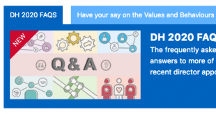
Of course not everything is working perfectly, so we are continuing to tweak and improve. For instance we found users were not noticing when new content was being posted in the campaign box. So we introduced a ‘new’ banner to signal this event.

Screen shot of 'new' banner on intranet homepage

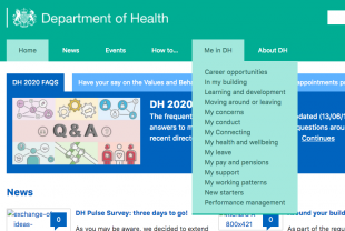
Information architecture

Our ongoing user research has repeatedly surfaced pain points for users navigating the site. Users did not always understand the main section headings, or what topics might be listed underneath.

To test further we ran several card sorting sessions to try and come up with better labels and a more intuitive architecture. Despite plenty of hard work, it turned out we couldn’t. Naming and sorting things into categories is just one of those timeless problems. We ended up agreeing that what we had was probably the least worst option.

To attack the problem from another angle we introduced some new functionality. We implemented the brilliantly named Accessible Mega Menu. This now provides a drop down of topics that appears underneath a section heading, to help users see what is available and help them answer their questions more quickly.

Screen shot of drop down menu on intranet homepage

Events

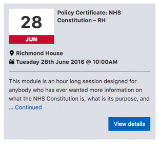
The department puts on a wide range of events.  By making use of theEventbrite API, our intranet administrators are able to create and manage events using all the functionality of Eventbrite. Once published, the event details are pulled automatically into the relevant intranet pages. Along with some design tweaks, we’ve made an already excellent events booking process even better.

Screen shot of events box on intranet events page

Our next sprint will be later in the year. Look out for further updates from a new product manager then.  And a final word of good luck and thanks to the brilliant team. My laptop will continue to wear our mission patch with pride.

This post was originally published on the Digital Health blog.

Continually improving our intranet

No digital product is ever perfect or finished. Even a site that is 90% cheaper than its predecessor, and boasts a user satisfaction reaching post-launch heights of 80%. My challenge as the new product manager for the Department of Health’s intranet is to build on that daunting baseline, and carry on the great work of my predecessor, Kylie Mulholland. Revisiting the lessons learned from the intranet’s first development seemed a good place to start.

Over the summer we ran a discovery phase to understand how people were responding to the new site. We found that overall, users much preferred the new product to what came before. However, they would still like to find things more easily through either search or navigation, particularly the things that help them do their job. These findings were borne out by analytics data: video conferencing arrangements consistently appear among the site’s top search queries. The discovery also revealed unmet needs on the editorial side, where content owners and editors wanted a more streamlined publication process.

Last week we brought together  a multidisciplinary agile team to begin a new period of development. We work in several organisations and multiple locations; Whitehall, Old Street, and as far as Atlanta, Georgia, so online tools like Slack, Basecamp, and Talky are helping to keep us connected with each other and our users.

Stubborn on vision; flexible on details

Our first step was to draft a set of high level goals for this phase of development, which support our overall vision of making the DH intranet the best in government. As ever, we welcome feedback.

  1. Users can find everything they need and access the services they want
  2. The intranet is accurate and trusted
  3. The intranet is easy and quick to update
  4. The intranet encourages user engagement
  5. The intranet meets the Digital by Default Service Standard

Borrowing a method from the Government Digital Service, we then built a prototype roadmap. This exercise forced us to think about what we would have to learn or prove if we wanted to achieve our goals. For instance, to show that “users can find everything they need”, we need to first find out what users are looking for, and then show, using data, that our improvements actually do help users find those things more easily.

We also identified and prioritised the big themes emerging from the discovery and mapped them against a rough timeline of development sprints. These included search and navigation, events, content management, and sign-in.

Finally, we used the roadmap to map out: our users, the wider ‘system of systems’ that support the intranet, our most important stakeholders, our assumptions, and any dependencies. This helped surface challenging questions early on. Our prototype roadmap is on display in Richmond House and will help us communicate to stakeholders what we are doing, why, and broadly when.

Our first sprint

Before we get going on new features, the team are first reviewing and cleaning the code base, fixing bugs along the way, and by the end of the week we’ll have it back in GitHub.  Making things open makes them better and from next week any organisation can take our code and ideas and start to build their own intranet sites, according to their own users’ needs.

I’ve learned a lot in my first weeks in product management. It has not taken long to experience the tension between user needs (what evidence suggests end users of the product want to see) and business needs (what other stakeholders would like their users to see). This forces you to ask some pretty fundamental and philosophical questions about the real purpose of the ‘thing’. I’ve also learnt that getting the right policy, process, and governance around the product may be at least as important as the product itself. Finally, I’ve sensed that many digital folk think that intranets are the devil’s work! It’s our job to prove them wrong.

Originally published on the Department of Health digital team’s blog.